Grid Layout
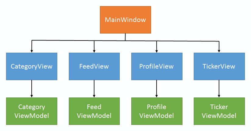
When composing an application, construct each view as a user control. Compose the user controls into a grid. This allows each view to be developed independently. At the same time, it allows windows of different orientations and sizes to reuse views.
Structure
A page or window contains several views. Each view has its own independent view model.
Design
The page or window contains a grid. The views populate the grid, with row or column span set appropriately.
XAML
The window defines an XML namespace to access the views.
<Window
    xmlns:Views="clr-namespace:XAMLPatterns.Views"
    >
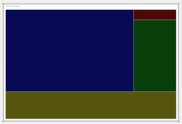
The window contains a grid that composes the views.
<Grid>
    <Grid.RowDefinitions>
        <RowDefinition Height="Auto" />
        <RowDefinition Height="21*" />
        <RowDefinition Height="8*" />
    </Grid.RowDefinitions>
    <Grid.ColumnDefinitions>
        <ColumnDefinition Width="30*" />
        <ColumnDefinition Width="10*" />
    </Grid.ColumnDefinitions>

    <Views:CategoryView Grid.RowSpan="2" />
    <Views:ProfileView Grid.Column="1" />
    <Views:FeedView Grid.Column="1" Grid.Row="1" />
    <Views:TickerView Grid.Row="2" Grid.ColumnSpan="2" />

</Grid>
The grid allows views to allocate their own vertical or horizontal space by setting the height or width to "Auto".